Bird Strikes
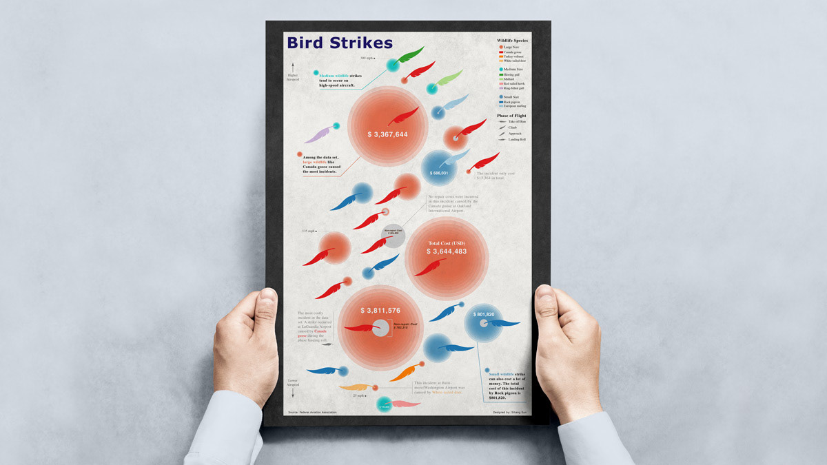
This infographic poster visualizes a subset of bird strikes data using a set of glyphs. The glyphs were designed to visualize 6 different dimensions of the data in one visual composite and facilitate user tasks that lead to meaningful insights.
To view the poser, click here.
Year
2022
Tools
R
RAWGraphs
Adobe Illustrator
Roles
Visual Designer
Data Analyst
Brief
Creating a set of glyphs that visualize a subset of bird strikes data set. The glyphs need to visually represent at least 6 variables of the data and the infographic need to include all 25 data points and facilitate user tasks that lead to meaningful insights.
Read on for more information about the design process.

Data
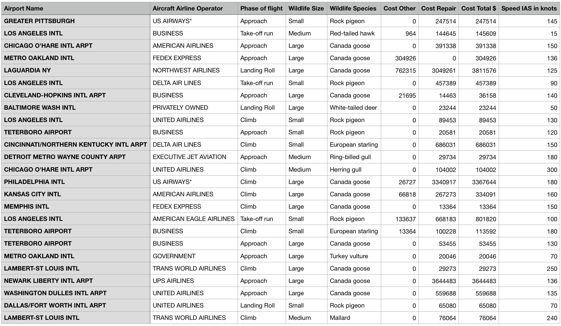
This data set contains 25 observations and 9 variables. Each observation describes a bird strike incident in the US. The original data set is from the Federal Aviation Association.
Data Analysis
A glyph is a visual representation of a data observation where the visual attributes of a glyph are dictated by one or more attributes of a data observation. A set of glyph has a great strength in describing inter-record and intra-record relationships in a data set.
To firstly explore the relationships in the data set, a scatter plot was created using ggplot2 package in R. The 4 continuous numerical variables can be grouped into two groups (cost and speed) and two representative variables from each group are "Speed IAS in knots" and "Cost Total $".
As shown in the scatter plot below, the speed variable is plotted on the x-axis, the total cost variable (log10) is plotted on the y-axis, and different colors correspond to different sizes of wildlife.
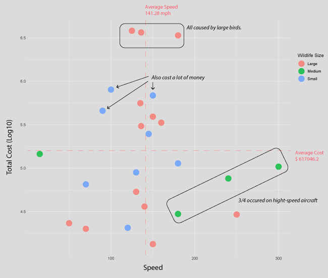
The scatter plot shows no correlation between aircraft’s speed and incident’s total cost in this data set. But some interesting insight worth to be revealed in the infographic.
Firstly, there are three most costly incidents on the top were all caused by large birds.
Second, Medium bird strikes usually to occur on high-speed aircraft.
Third, the costs of small bird strikes can also be high, despite the fact that large birds caused many costly strikes.
Later, annotations in the infographic were designed to help viewers find these insights.
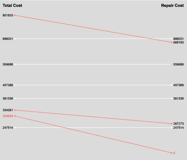
Variables “Cost Total”, “Cost Repair”, and “Cost Other” have part to whole relationships, which can be illustrated as "cost repair + cost other = cost total".
Most incidents' total costs equal their repair costs, as shown in the slope chart above. Some incidents, however, caused fewer repair costs and substantial amounts of non-repair costs.
The $304,926 incident in the data set didn’t incur any repair cost. These outliers also worth to be called out in the infographic.
Sketches & Ideas
The main part of the glyph is a bird feather like element to make it visually appealing and fit the theme of the data set.
This element serves as a human recognizable object. According to some researches, human recognizable objects allow a visualization to be retrieved from memory more effectively and help convey the message of the visualization.

The second part of the glyph is a circle. As a commonly used visualization mark, circle is readily perceived visual element and its visual attributes are later used to encode many data variables.
Moreover, the circle element also mimics the damage used to represent damage cost related data variables, as bird strikes produce bullseye type damages.
Mapping & layout
To visualize 6 different variables using glyph, several visual attributes of the glyph are encoded by data. The mappings of visual attributes to each data variable are as following:
Speed IAS in knots: vertical position
Cost Total: size of the outer circle
Cost Other: size of the inner circle
Phase of Flight: direction of the feather
Wildlife Size: color of the outer circle
Wildlife Species: color of the feather
In order to facilitate the user's task of exploring relationships among different variables in the data set, the glyphs were plotted along the vertical space of the poster using ordering relationships derived from the speed variable.
In other word, higher the glyph, higher the speed recorded in the observation.
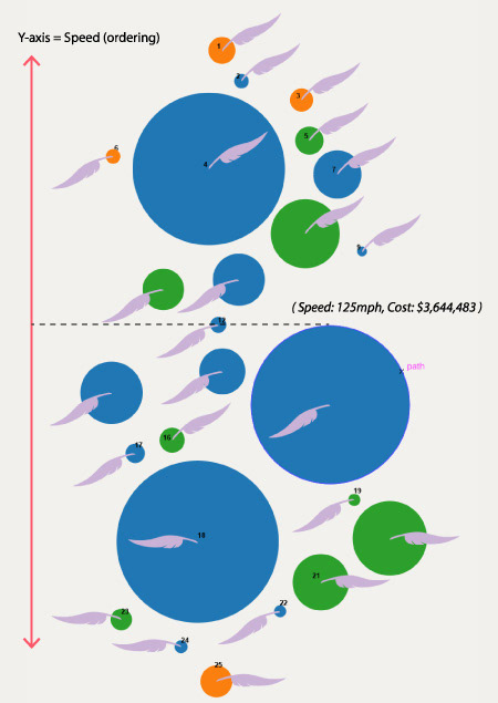
In this way, the user can perceive other dimensions of the data along the vertical position (speed) to explore the relationships between speed and other variables and led to interesting insights.
Development
To accurately encode the data, the circle part of the glyph came from a bubble chart of the data set made in RAWGraphs. Adobe Illustrator was used to design other visual elements, annotations, and the layout.
