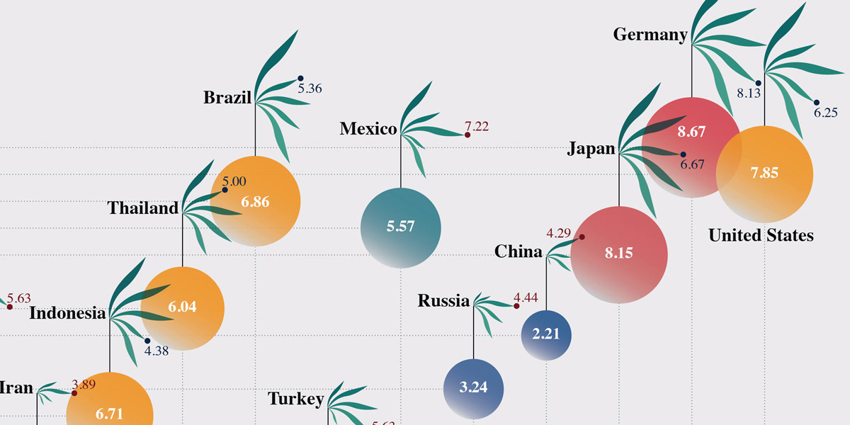
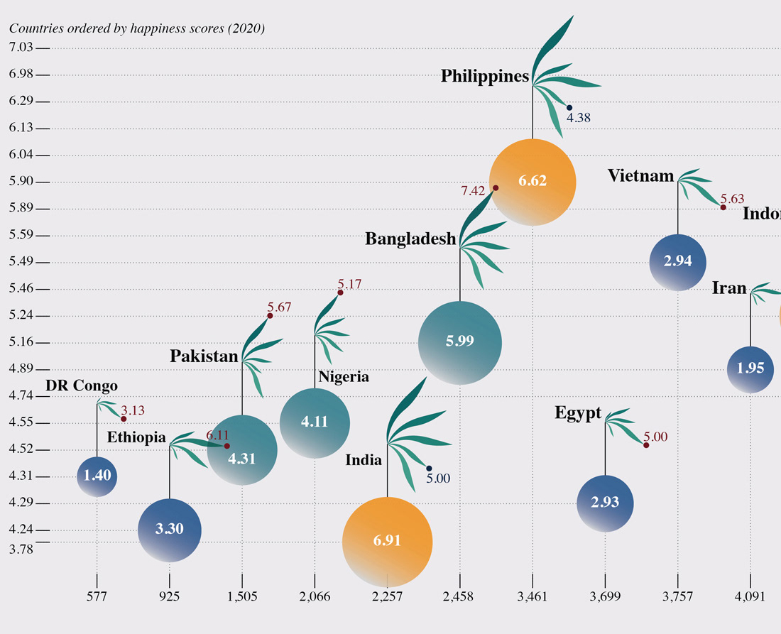
The Shape of Democracy
This visualization shows Economist Intelligence Unit's Democracy Index 2021 data for the world's top 20 most populous countries. The visualization encourages readers to
explore the relationships between political systems, material satisfaction, and overall happiness.
To view it in full size, click here.
Year
2023
Tools
Adobe Illustrator
RAWGraphs
Roles
Information Designer
Data
The democracy index data comes from the EIU's annual report. The happiness score data comes from ourworldindata.com. This visualization uses the latest World Bank data on GDP Per Capita and population.
Read on for more information about some key design decisions.

Visualization
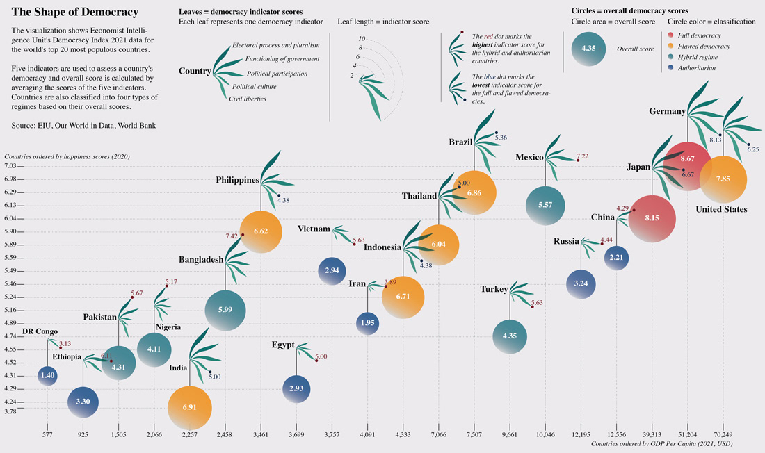
Legend
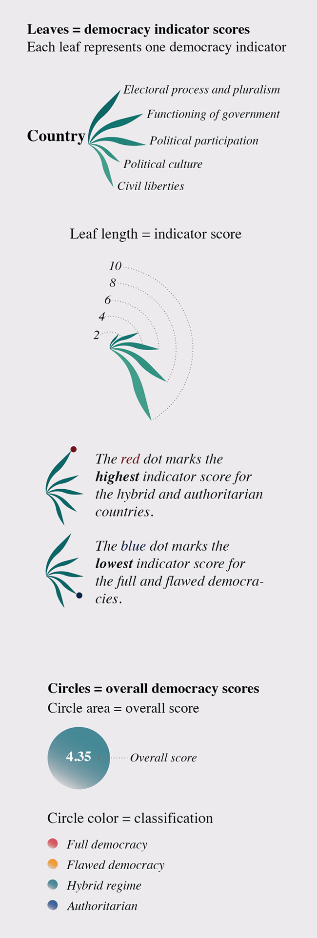
Details
Key design decisions
Why GDP and happiness score?
EIU wrote in its Democracy Index 2021 report, “Any system must be judged by the degree to which it maximises humankind’s ability to live “the good life” … it rests on … the satisfaction of material needs;”.
It still remains my personal belief that democracy, despite many of its shortcomings, is the optimal political system most aligned with mankind's universal values. But I also often wonder if this best system truly brings the people "the good life"?
For that reason, I selected GDP Per Capita as well as happiness score as contextual information in this visualization to explore the relationships between political systems, material satisfaction, and overall happiness.
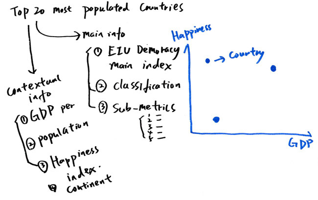
Initial mapping idea
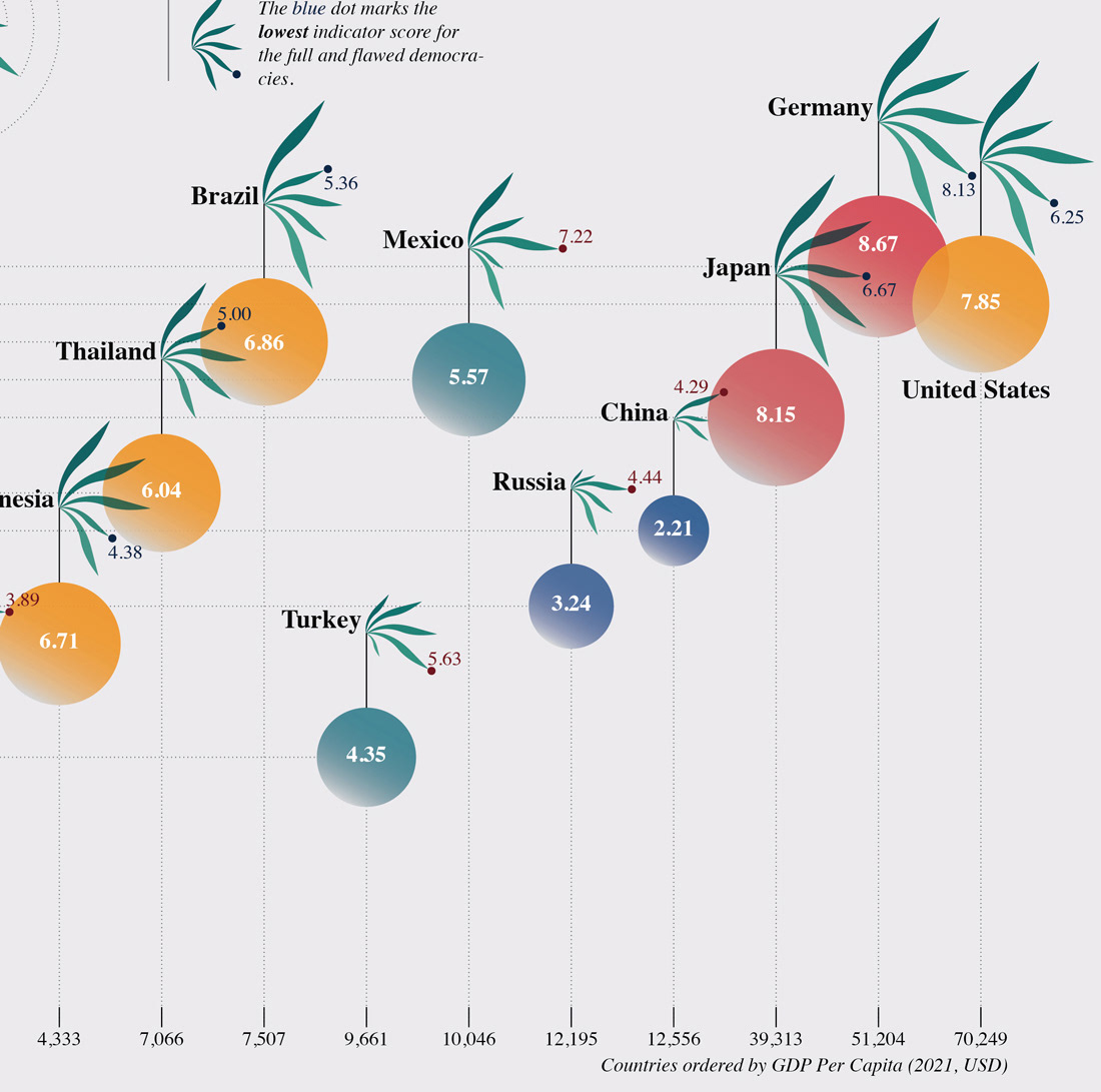
In the visualization, 20 countries are ordered along the vertical axis by the country's happiness score and along the horizontal axis by GDP Per Capita. In reading a country's democracy index, I also hope that readers can get a sense of the country's economy and happiness, so they can think about the relationship between them.
Design the main visual element
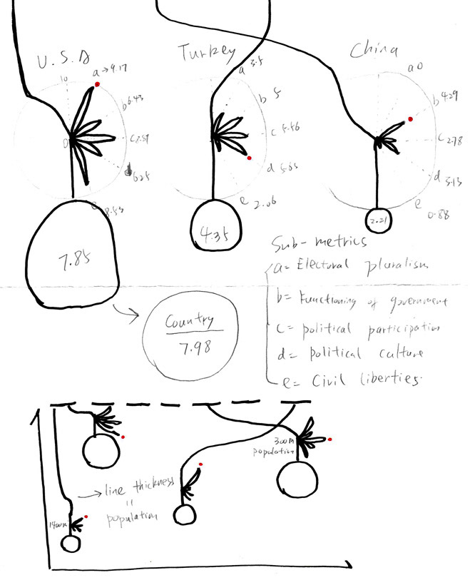
Leaf and fruit were used as visual inspiration for main visual element. Overall democracy scores (fruit) provide a simple way to evaluate a country's democratic state. But the individual indicator scores (leaf) and their pattern give readers a full picture of a country's democracy and why that country scores the way that it does. In the same way that leaves nourish fruit, fruit of democracy cannot flourish without big leaves.
Sketch of main visual element
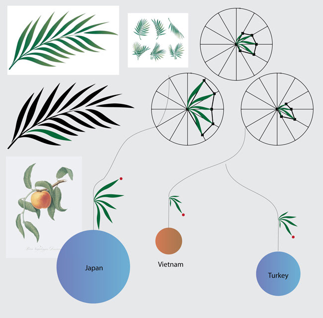
Implemented the design idea in Adobe Illustrator
That is also why I used two different visual attributes of the main visual element to represent the same metric data ( The overall score is calculated by averaging the scores of the five indicators ). As a result, I hope to give both the main metric data and sub-metrics data equal visual weight and encourage readers to take the time to read them both carefully.
Why highlighting the highest and lowest scores?
In the visualization, I used dot to highlight the highest indicator score for non-democracies and lowest indicator score for democracies. The aim of this design decision is to encourage readers to examine the inadequacies of democracy in democratic countries and also the promising aspects of non-democracies.
