MBTA Subway Crowding Dashboard
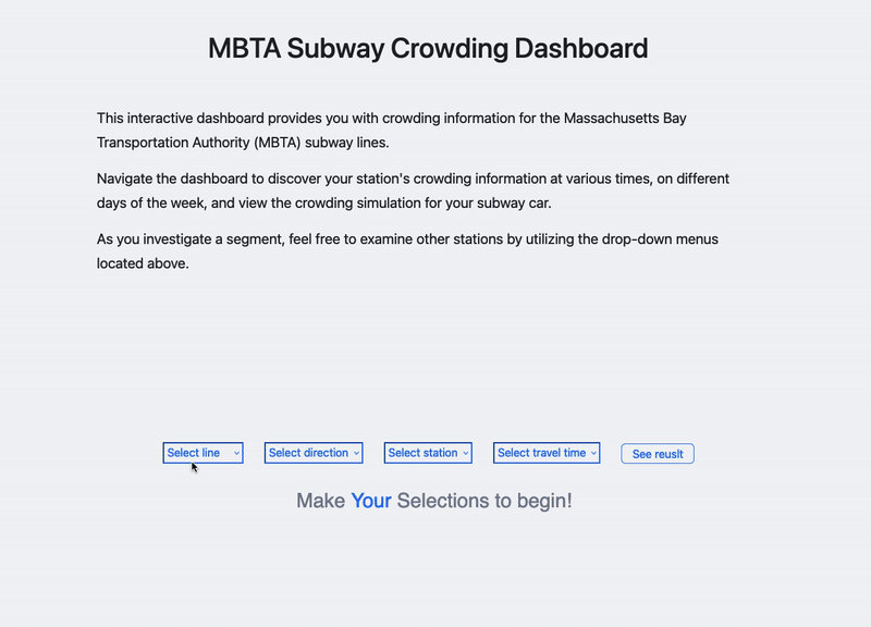
MBTA Subway Crowding Dashboard is an online interactive dashboard that provides MBTA subway crowding information. The dashboard enables users to explore a station's crowding information at different times and on various days of the week. It also provides a crowding simulation for your subway car and presents crowd levels throughout your entire trip.
View this project, click here.
Year
2023
Tools
HTML/CSS
D3.js
Roles
Information Designer
Data Analyst
Front-End Developer
Data
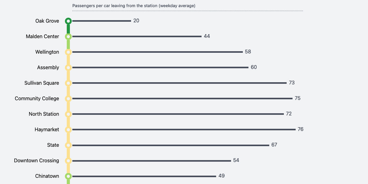
The data shown on the dashboard are crowding metrics calculated using MBTA ridership data provided by Korbato.
Read on for more information about the design methods.

Design Methods
This project took a different approach to design a public-facing dashboard. First of all, instead of an all-in-one view traditional dashboard, this project aims to minimize the cognitive loads of the reader, to have visualizations spread into multiple views. Limiting the display to one topic at a time helps prevent the reader from feeling swamped by excessive information.
Visualizations spread into multiple views
Secondly, the dashboard has a partially author-driven narrative pattern, in which the viewer is guided browser through the whole site and accompanied by some explanatory texts. I believe, this will help the viewers better explore the dashboard by giving them enough instructions.
Thirdly, when it come to designing a public-facing dashboard, we are thrilling to show useful information and insights to our audiences not just data. Therefore, we aggregated data, developed easily understandable metrics, and designed intuitive visualizations (including the crowd simulator). by doing so, we aimed to create a dashboard that offers actionable insights and helps viewers make informed decisions.
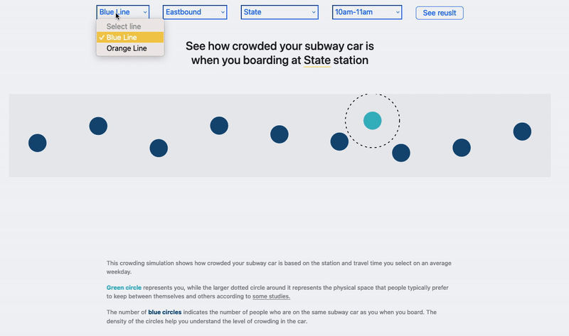
The crowd simulator in the dashboard
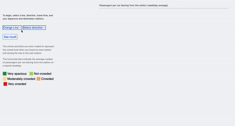
The interactive trip crowd level dashboard
Finally, a public-facing dashboard should engage viewers with visually appealing visualizations, not just boring statistical charts. In line with this idea, our project has made an effort to design and develop engaging visualizations that draw viewers in and encourage them to explore the underlying data.
Future work
I have to acknowledge that this dashboard at this moment is not a full-stack website. Ideally, it should have the ability to automatically update every two weeks to reflect the most recent crowding situations on the MBTA subway system. In order to achieve this, the dashboard needs to be able to connect to an API and fetch the latest data from the data owner. To accomplish these data engineering tasks, further development work will be required for this project.
