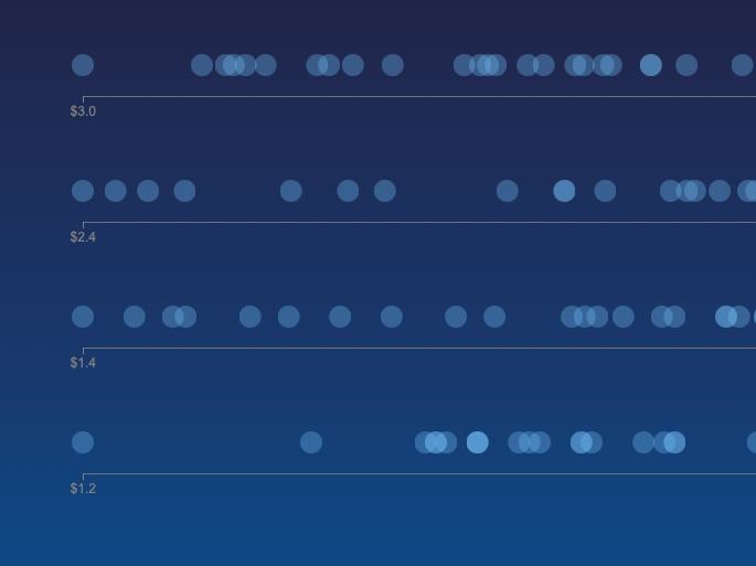
Exploring the Price of Living Across Major U.S. Cities
An interactive tool for looking up and comparing the prices of 31 goods and services across 30 different U.S. cities.
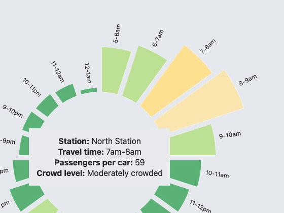
MBTA Subway Crowding Dashboard
An interactive dashboard that provides MBTA subway crowding information.
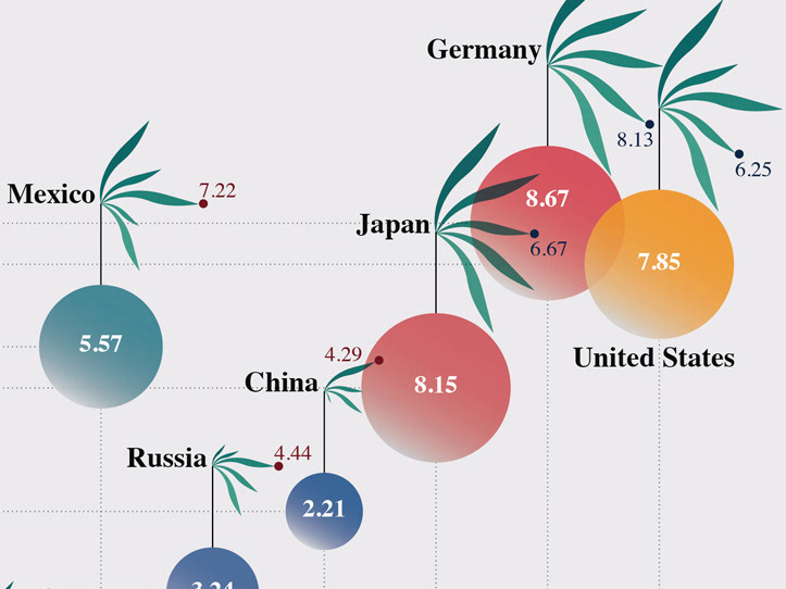
The Shape of Democracy
The visualization shows EIU Democracy Index 2021 data for 20 countries
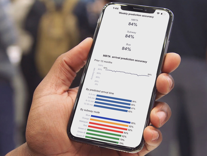
MBTA Performance Metrics Dashboard
Features four interactive dashboards that track and display transportation performance metrics
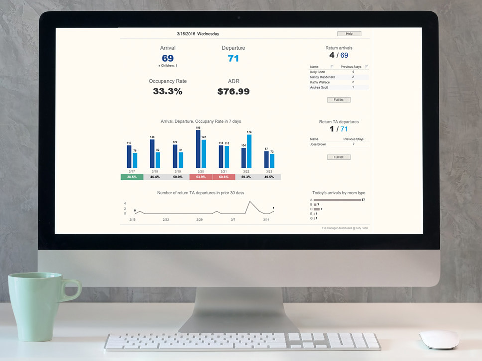
Hotel Manager Dashboard
An interactive dashboard for hotel managers to access key operational and management information.
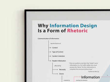
Why Information Design Is a Form of Rhetoric
This concept map shows why information design is a form of rhetoric and proposes three rhetorical means used in information design.
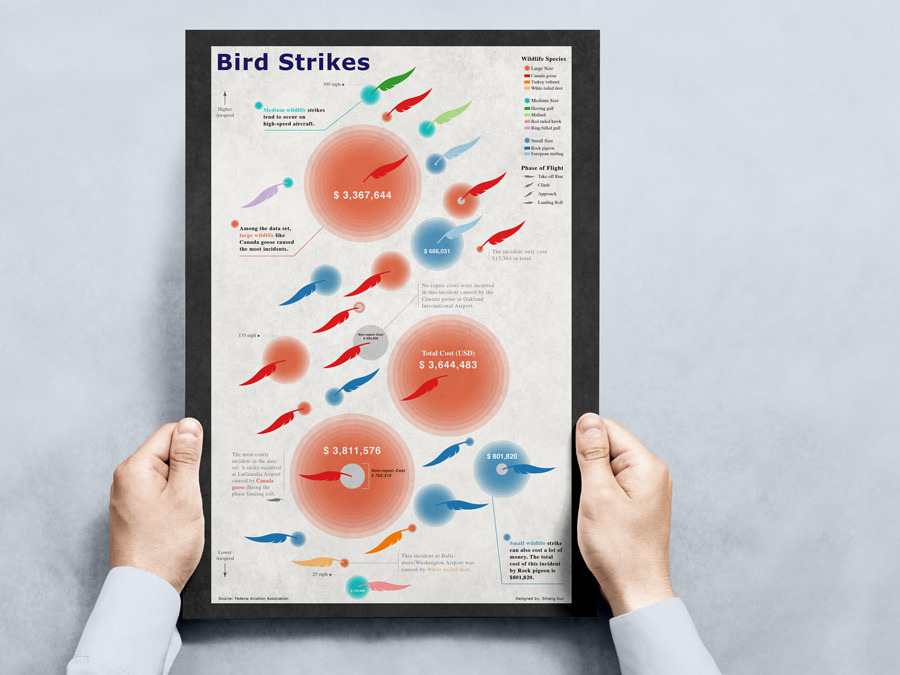
Bird Strikes
An infographic poster visualizes a subset of bird strikes data using a set of glyphs.

American billionaires VS Chinese billionaires
This project explores how American billionaires and Chinese billionaires dominate the billionaires list across all industries.
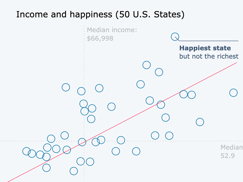
The Richer, the Happier?
This project explores the relationships between happiness and income from a "state level".
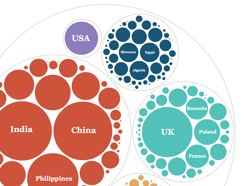
Observations on Immigration In Canada 1984-2013
This report explores several topics related to immigration in Canada in these 30 years